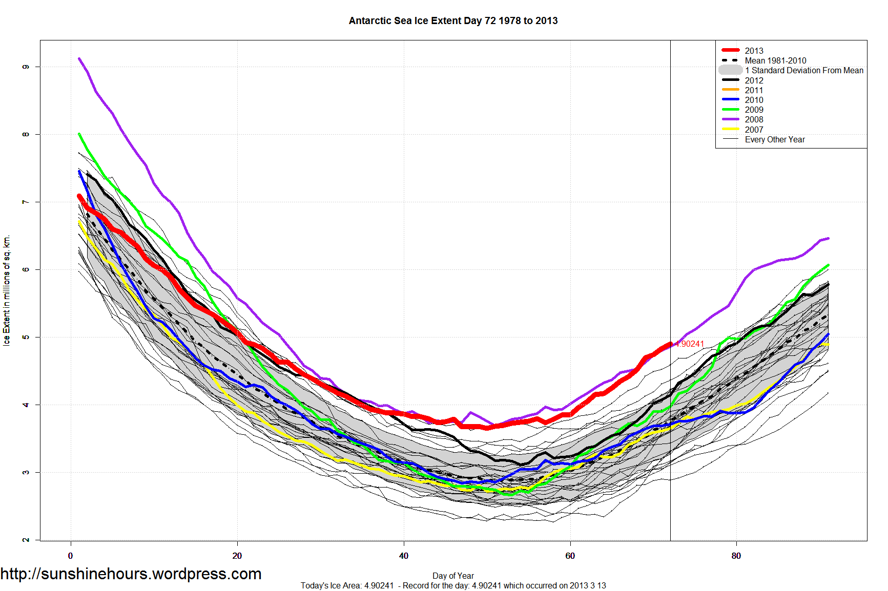
Via Idaho real estate mogul, reader, friend, and former colleague Doug S.:
The source...
Showing posts with label Visualization. Show all posts
Thursday, May 30, 2013
Saturday, March 16, 2013
Thursday, February 28, 2013
Visualizing Formerly Invisible Motion (and More)...
Through a technique dubbed “Eulerian magnification”, computer scientists are getting better at producing stunning, informative visualizations. The video tells the story, and there are more details in the accompanying story. This search will show you many more videos produced via Eulerian magnification. What an awesome new tool!
Labels:
Awesome,
Science,
Visualization
Wednesday, December 19, 2012
Visualized: Pythagorean Theorem...
This is just awesome – the Pythagorean Theorem in a beautiful and intuitive visualization (a demonstration, really)!
Labels:
Awesome,
Math,
Visualization
Monday, August 13, 2012
Sloan Digital Sky Survey...
The Sloan Digital Sky Survey has cataloged some 400,000 galaxies (each with billions of stars), including their locations in the universe. Below is a video made by “flying” through a simulation created from this data. It's the best 3D visualization of our universe that I've ever seen...
Labels:
Astronomy,
Science,
Space,
Visualization
Thursday, June 16, 2011
Life Expectancy in the U.S...
The Institute for Health Metrics and Evaluation (IHME) has a fascinating interactive map that shows the changes in life expectancy over time. At right I took a screenshot of the most recent data (green is good, red is bad). I'm fascinated by how much regional difference there is even in a country as homogenous as the U.S.
If you visit their map page, play with the sliders at the bottom to select the period of time you're interested in...
Labels:
Life Expectancy,
Visualization
Friday, October 16, 2009
Yikes!
Absolutely fascinating animated visualization of job losses and gains over the past 5 years or so. The end of this animation is enough to make your hair stand on end (if, unlike me, you have much of that commodity left)...
Labels:
Economics,
Jobs,
Recession,
Visualization
Fascinating Visualization...

For the past year or so we've all been inundated by a never-ending series of gigantic financial numbers – $300B for this, $750B for that, $1.2T for that. Getting any sort of understanding about these numbers is challenging; I, for one, will take any help I can get.
So when I saw this graphic, I found it instantly appealing. By visualizing the relative amounts of money as different sized colored polygons, the authors have put the data in a form that our brains can easily digest.
Take a tour! And check out the whole site -- it's full of interesting visualizations like this...
Labels:
Finance,
Visualization
Subscribe to:
Posts (Atom)