
First up, chart that seems like a reasonable proxy for an non-manipulated (by the government) measure of the overall economy's rate: overall gasoline sales. This isn't a perfect proxy, to be sure. For instance, we know that the overall efficiency of U.S. cars and trucks is improving. On the other hand, that improvement is partially or entirely offset by our growth in population. However, prior to the current recession, gasoline sales have grown steadily and in at least rough proportion to the overall economic rate – so despite the known sources of error, it seems like a good proxy. Plus, it has one extremely important attribute: this is reported as raw data, not “adjusted” by some bureaucrat to suit the current political need. Behold:

Current retail gasoline sales are running at around half what they were in 2007. It's hard to imagine any way that's a good indicator. More here.
Here's a completely different measure, a breakdown of something I posted just a few days ago: labor force participation rates, broken down by age groups.
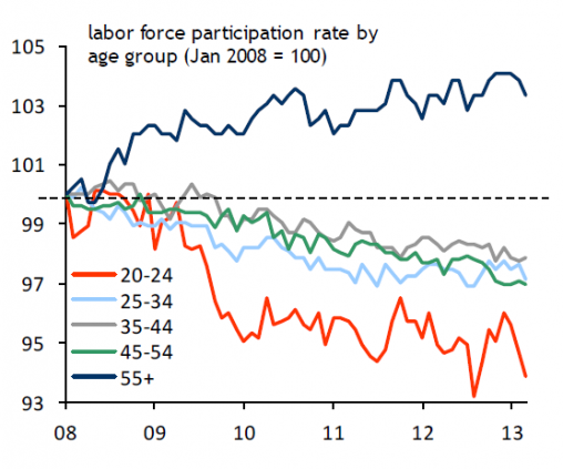
The only age group where the participation rate is growing is for people aged 55 and older! For all other age groups, the participation rate is falling. That doesn't look like a healthy recovery to me! More here.
No comments:
Post a Comment