
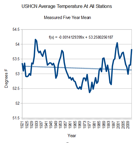
This particular data is from USHCN, but many other sources of climate data worldwide show similar discrepancies between the raw data and the presented data. The entire issue could be easily resolved if the climatologists would simply release their adjustment methodologies – but to date, not a single one has. This raises all sorts of red flags for me, as it's the antithesis of the way science is normally conducted...
No comments:
Post a Comment