What does this graph say to you? Take a good, hard look at the graph at right,
taken from this paper. What's your takeaway? Mine is this: “Eisenhower is my hero.” He's the
only postwar president who kept federal spending relatively steady. The numbers make it clear: post-Eisenhower, both major political parties have consistently supported ever-growing government spending. There's not even a
whiff of responsible governance there. Or of sanity – stare at the right-hand side of that graph and it's clear this trend is accelerating.
The drums of doom – or revolution? – beat ever closer...
I got here through
this article at Reason, wherein Nick Gillespie takes both political parties to the woodshed for their unserious approach to managing our money...
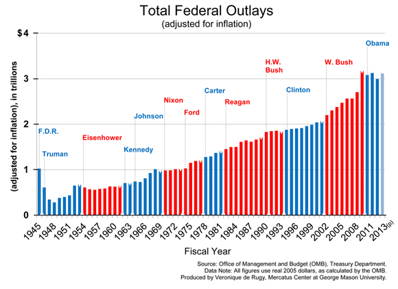

So under which presidents has federal spending consistently been below their immediate predecessor's peak level? Well, there's Eisenhower and there's... um... well... maybe you want to crop the right-hand side of the graphic a bit.
ReplyDeleteIf your point is that spending under the Obama administration has been basically level, well then, that's absolutely true. And it's been below, though ever-so-slightly, spending under GW. But Obama isn't done yet, and barring some radical success by the Tea Party (or any other convertees to small government), I'm pretty sure spending in his last three years is going to explode - some combination of ACA (aka ObamaCare) expenses, sequester rollback, inflation, and progressive victories ought to do it :)
Delete