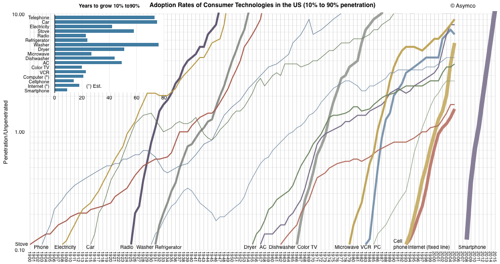
Rates of technology adoption... Fascinating graph comparing the rates of penetration for various new technologies, going back to stoves in 1900. The key point is that adoption rates are accelerating, as can easily be seen as those penetration curves get steeper and steeper. One note: the vertical axis is perhaps not what you'd expect. Rather than showing penetration percentage, it's a log scale of the ratio of penetrated to unpenetrated. That's easy to convert to penetration percentage: 0.1 = 9%, 1.0 = 50%, 10.0 = 91%.

No comments:
Post a Comment